Yesterday I published a post with some initial readings of the Altmetric 2014 Top 100 articles (I’ll be calling them “outputs” as some are not versions of record).
[If you are new to altmetrics please read:
- “What does Altmetric do?” https://www.altmetric.com/whatwedo.php and
- “How is the Altmetric score calculated?”, http://support.altmetric.com/knowledgebase/articles/83337-how-is-the-altmetric-score-calculated]
I am interested in being able to investigate whether any trends in publication access preference can be detected, or at least in registering the evidence in order to be able to compare with new data next year for example.
I looked at the countries of affiliation of the authors of the papers (some papers in the list had only authors from the same country, while others had various authors from different countries). There are 39 unique countries of affiliation in the list:
| Country |
| Argentina |
| Australia |
| Austria |
| Belgium |
| Brazil |
| Canada |
| Chile |
| China |
| Czech Republic |
| Denmark |
| Ecuador |
| Finland |
| France |
| Germany |
| Greece |
| Guinea |
| Indonesia |
| Ireland |
| Israel |
| Italy |
| Japan |
| Kenya |
| Mexico |
| Morocco |
| Nigeria |
| Norway |
| Poland |
| Puerto Rico |
| Republic of Congo |
| Romania |
| Russia |
| Sierra Leone |
| Singapore |
| Spain |
| Sweden |
| Switzerland |
| The Netherlands |
| UK |
| USA |
Some outputs in the list had affiliations from only one country. The countries with one-country affiliation outputs in the list are:
| Country |
| Australia |
| Austria |
| Canada |
| China |
| Czech Republic |
| Denmark |
| Finland |
| France |
| Germany |
| Israel |
| Italy |
| Sweden |
| The Netherlands |
| UK |
| USA |
Apart from a few dominant countries of affiliation in the majority of the outputs in the list (the USA, Canada, France, Germany, the UK) most other countries do have a relatively minimal number of contributions. As Cat Chimes pointed out in her blog post, “68 of the Top 100 had authors from the United States, 19 had authors from the UK, 10 from Canada, 11 from Germany (the most in Europe), 4 from China, and 9 from South or Central America” [I counted 20 outputs with authors with UK affiliations, but I may have made a mistake– I shall check…].
I like alluvial diagrams because even though they require context (for example for knowing the exact numbers behind the volumes/height/density of nodes) they do provide a quick visual insight into the links between different columns/labels in a dataset.
An alluvial diagram of the whole list by access type proved visually chaotic and confusing. Therefore I made some diagrams by grouping them in regions (I did not use the original region categorisation provided by Altmetric). These are the regions I wanted to look at first, not all the regions/countries included in the list.
I started by comparing number of affiliations from the UK and the USA by the access types of the outputs they contributed to:

Please note that as indicated above some of the outputs visualised in this diagram were jointly written by authors from the UK, the USA and other countries. What the diagram in this case compares is the access types of outputs with authors from either country, so a section of each access type will always overlap, which means this diagram shows the presence of either country of affiliation, but they are not mutually exclusive.
Following this case of the UK and the USA, a comparison can be made with a diagram showing outputs with authors from one single country of affiliation, which might prove more interesting:

Or, for further clarity, as a bar chart:
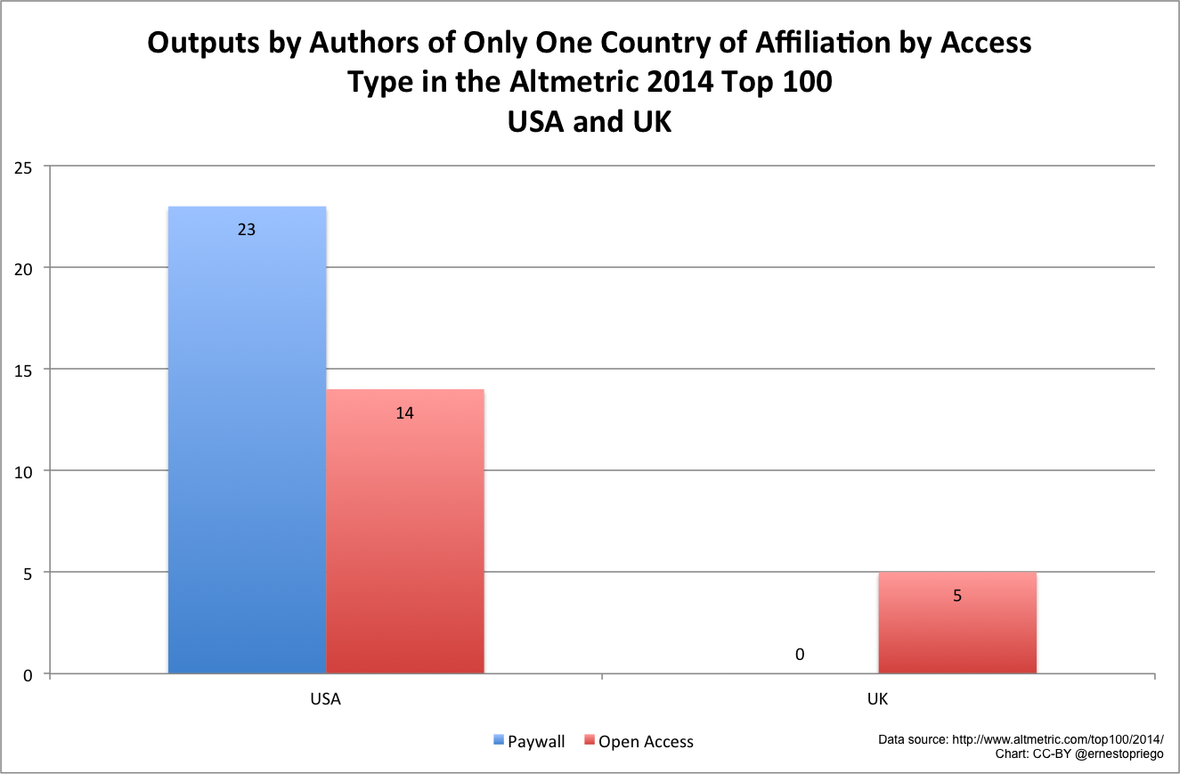
It is interesting that the only outputs in the 2014 Altmetric Top 100 list by authors affiliated to UK institutions (and no other countries) were open access and not paywalled. (Once again this might be explained by Altmetric’s sources).
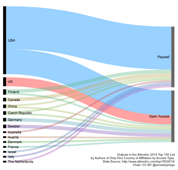
With the intention of offering some context, the following diagram shows all the outputs by authors from a single country of affiliation in the 2014 Altmetric Top 100 list by access type:
I points I found interesting from making and looking at the charts:
- A clear split (almost 50/50) of paywalled and open access outputs by authors of various international affiliations including authors from UK and USA institutions
- 37 of the 100 outputs in the list had authors from the USA only (no other country affiliations). The 37 USA-only outputs were divided in 23 paywalled (62%) and 14 open access (38%). This in stark contrast with the 5 UK-only outputs, which were all open access.
- As in the case of UK-only outputs, when countries had more than one single-country output they did not always split into two access types. If the UK-only outputs were all open access, All the Netherlands, Italy, Israel, Australia and Czech Republic single-affiliation outputs were paywalled.
- Germany, which had the highest number of outputs from Europe in the list (11), had 9 outputs in collaboration with various countries, all paywalled. The other two outputs were single-affiliation (Germany-only), both open access.
I have made a series of other diagrams but I will share them in a forthcoming post.
N.B.
As always, please take into account that these are not just 100 outputs mentioned online, but those with the most impressive number of “mentions” (links to permanent identifiers) in the online sources tracked by Altmetric. There is no suggestion that the online popularity of these outputs reflects uncontroversially their “quality”. The fact is that they’ve been mentioned (linked to) on line, and in the current landscape of scholarly communication, I find this fact not without its significance.
The sample of 100 outputs might be considered small, and the bias implicit in Altmetric’s sources and tracking mechanisms impose a series of important caveats to offering any robust conclusions at the moment. However, there is already some data we will be able to compare with future data in the short and long term.
—
Priego, Ernesto (2014): A List of the 37 Open Access Outputs Most-mentioned Onine in 2014 According to Altmetric. figshare.

You must be logged in to post a comment.